dsh-theme-palette
Verifieddsh-theme-palette · v1.9.10 · MIT · Web UI
DSH 主题配色:4 套配色 × 明暗两模式,OKLCH 色域安全重建 + 真实承载面对比度求解,可调强度与面板表面。
Install
dsh plugin add dsh-theme-palette Confirm the layer applied with dsh --profile default --dump-config — see the install guide.
Source
Tags
Readme
dsh-theme-palette
English · 中文 · Español · Português · हिन्दी
Theme palette for DeepSeek Harness (web & desktop): 4 palettes × light/dark, two independent axes.
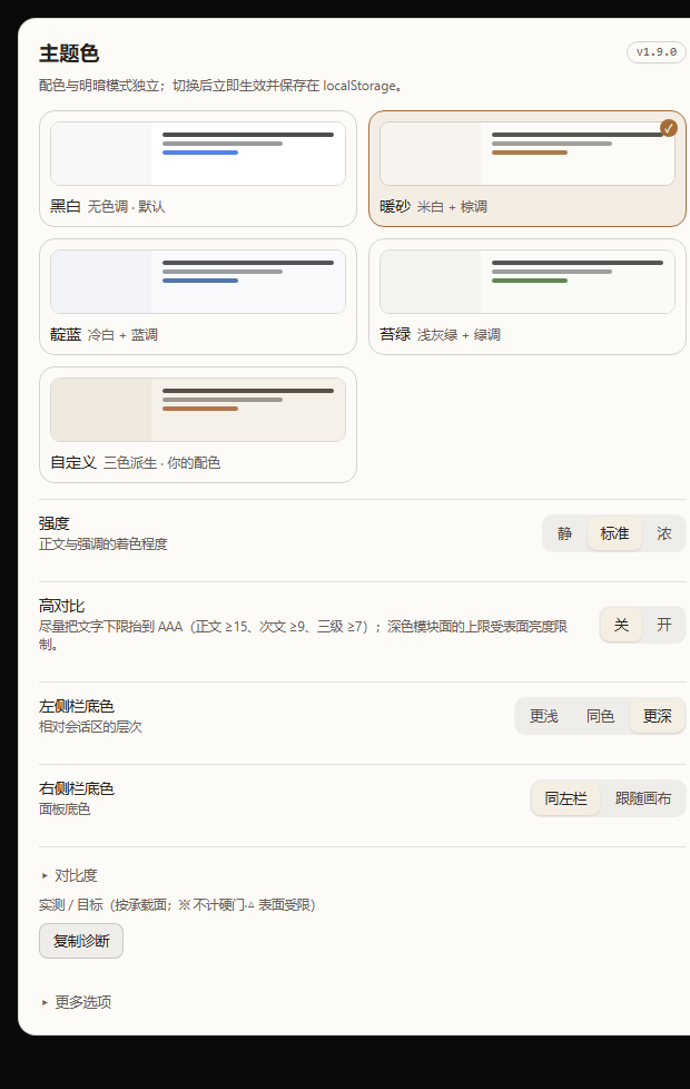
Static render of the settings page at the real panel width (564 px content).
| Dark | Custom palette | High contrast |
|---|---|---|
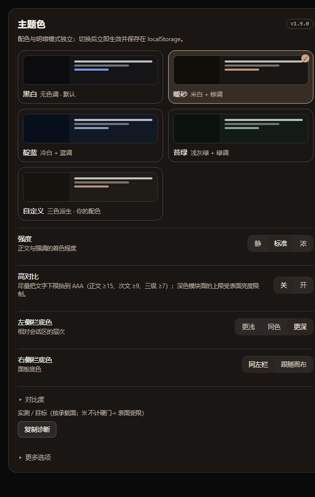 |
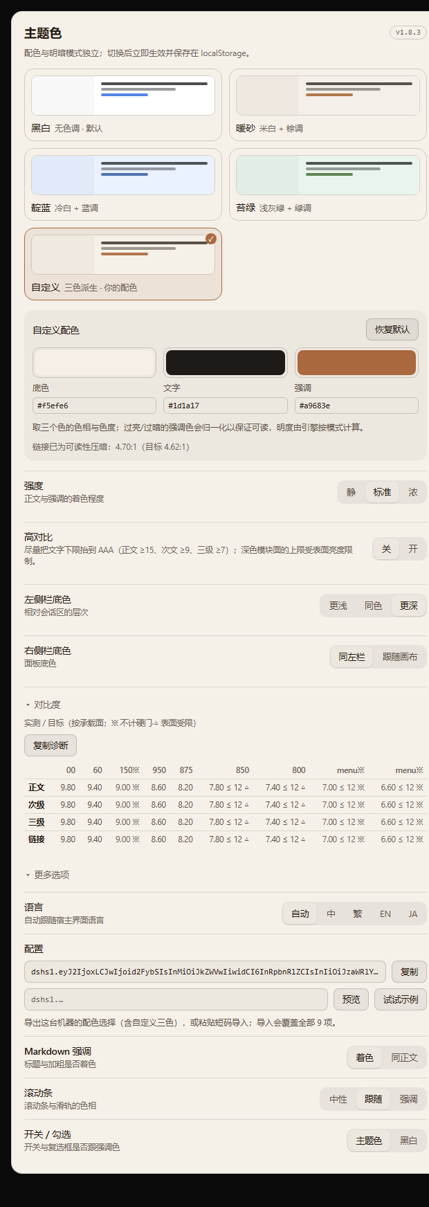 |
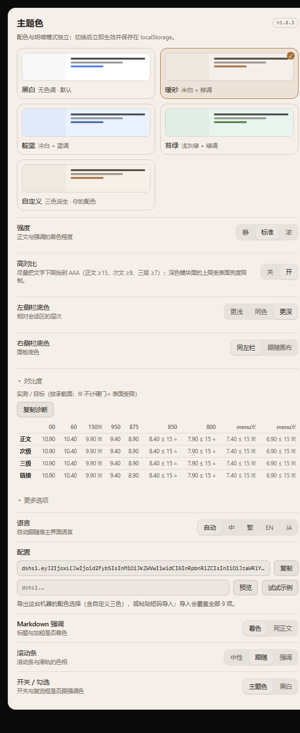 |
Compatibility
| Surface | Status |
|---|---|
| DSH desktop / web client | 0.2.x |
| Node.js | 22.19.0+ (on the 22.x line) or 24.0.0+ |
| Changes to host source | none |
The engines field of the package is ^22.19.0 || >=24.0.0 — the row above is the same requirement in prose.
The plugin only stacks colour tokens through ctx.theme.overrideTokens; it does not register a theme, patch the host, or touch the appearance preference.
What it does
- 4 palettes — Mono, Warm sand, Indigo, Moss — each adapting to light and dark independently;
- the whole ramp is recomputed, not swapped: OKLCH rebuild → role-based chroma → sRGB gamut clamp → contrast solved on real surfaces;
- 27,000+ token references covered: body, secondary, tertiary, captions, links, sidebars, cards, user bubble, primary button, scrollbars, switches, Markdown headings/bold, code blocks;
- adjustable: text tint (3), sidebar depth (3), Markdown emphasis, scrollbars, switch colour;
- custom palette (pick surface / text / accent — the engine keeps its contrast guarantees), config export/import via a
dshs1.code, high-contrast mode, and 4 UI languages; - self-healing: if the host drops the override layer, the palette is re-applied;
- contrast promises: body text is promised 12:1 in light and 10:1 in dark (15:1 in high contrast), secondary ≥ 6.2 in light / 8.0 in dark, tertiary and links ≥ 4.62 in light / 6.4 in dark (links also clear an APCA Lc ≥ 60 gate in dark / 75 in HC) — measured on the surfaces the text actually lands on (the dark side needs more, because a WCAG ratio overstates readability on a dark background);
- the promised surfaces are light 00/60 and dark 950/875; dark 800 (module surface) and 850 (sub-surface) do not back body text — the report counts them apart as "out of policy" (neither pass nor fail);
- UI in 简体中文 / 繁體中文 / English / 日本語 (follows the host language, can be pinned).
Install
# from npm
cd ~/.dsh/profiles/desktop
pnpm add dsh-theme-palette
To pin a version, use pnpm add dsh-theme-palette@<version> — the current release is listed in CHANGELOG.md.
From a GitHub Release tarball: pick the asset on the releases page and install it with pnpm add <path-to-tgz>.
Then restart the GUI — a running process keeps the old module. Open it from avatar → Settings → Color theme.
Configuration
| Item | Options |
|---|---|
| Palette | Mono · Warm sand · Indigo · Moss (thumbnails follow light/dark) |
| Strength | Quiet / Standard / Strong — how much body text follows the palette |
| Panel surfaces | Sidebar (Lighter / Same / Deeper). The right panel is never tinted — it is a full-height transparent overlay, so painting it would cover the conversation (the setting was removed in 1.9.10) |
| More options | Language, Markdown emphasis, scrollbars, switches/checks |
Every choice applies immediately and is stored in localStorage. Light/dark stays under the host’s Appearance control.
Palette engine
OKLCH(L, C, hue) ──► gamut clamp (binary search on C) ──► sRGB hex
        ▲
        └── role chroma × intensity, then contrast solve on {canvas, card, sidebar, overlay}
- semantic aliases keep
var(--dsw-static-neutral-bluish-NN)chains, so anything following a token follows the palette; - light surfaces use steps 00–300, dark surfaces 800–950;
- text floors are enforced at build time: body ≥ 12:1 in light and ≥ 10:1 in dark (high contrast: 15:1), secondary ≥ 6.2 in light / 8.0 in dark (HC 9 / 9.6), tertiary/link ≥ 4.62 in light / 6.4 in dark (HC 7 / 7.6), link APCA Lc ≥ 60 in dark (HC 75), sidebar text ≥ 7, bubble text ≥ 7;
- the promised surfaces are light 00/60 and dark 950/875; dark 800 (module surface) and 850 (sub-surface) do not back body text — the report counts them apart as "out of policy" (neither pass nor fail), and every surface still has to clear the AA floor of 4.5;
- the report separates three things: the declared target, the physical ceiling (what black or white can reach on that surface) and the policy exemption; 0.93 is only a solver margin, used to decide whether a target sits above the ceiling;
- 2160 configuration combos (5 palettes × 216 settings × both contrast tiers) are checked by
node palette-dev.mjs.
Design notes, per-component rationale and the contrast tables live in docs/DESIGN.md. Release history: CHANGELOG.md.
Development
node palette-dev.mjs                  # token report for all palettes
node tools/sheet.mjs                  # palette board → tools/sheet.html
node tools/shoot-sheet.mjs            # screenshot the board (headless Chrome)
node tools/compare.mjs --dir tools/out/<run>        # diff against baseline
node tools/preview-settings.mjs --lang en           # render the settings page
node tools/release.mjs --dry          # release preflight
node tools/release.mjs --tag          # publish to npm + tag
Screenshot regression has two layers: the palette board (no auth needed) and the real desktop window via CDP (tools/shoot-desktop.mjs, needs --remote-debugging-port). See tools/README.md.
Pitfalls we hit
The five that surprised us most during the 1.7.0 audit — each one was found by a test, not by looking at screenshots.
- A white accent produced a white link (1.13:1). The contrast solver only ever walked away from the background in one direction, so an accent brighter than the background kept moving toward white.
- Picking a colour changed the page but not the panel. The component subscribed to the palette id, which never changes when a colour does — React compared the snapshots, saw no difference, and skipped the re-render.
- Sharing a configuration did not share the colours. The short code carried the modes but not the three custom colours, so importing on another machine reported success and silently kept the local values.
- "Not promised" is not "impossible". The report called the dark module surfaces "surface-limited" because it compared the body target against the deepest one (800). But 800 reaches about 10.22:1 and 850 about 15.27:1 with a white foreground — above the 10:1 target — so nothing was ever unreachable; those surfaces simply were not promised. The report now separates the declared target, the physical ceiling and the policy exemption, and counts dark 800/850 as "out of policy" instead of "physically unreachable".
- A selector we thought was dead was alive. The audit initially reported the
_markdown_hooks as broken; the contract test against the shipped CSS proved otherwise. The finding was wrong, not the code.
Sharing
Every setting — including the three custom colours — travels in one short code. Paste it into the import box and press Preview to see exactly what it will change before applying:
dshs1.eyJ2IjoxLCJwIjoiY3VzdG9tIiwicyI6ImRlZXAiLCJ0IjoidGludGVkIiwiciI6InNpZGViYXIiLCJjIjoidGludGVkIiwiayI6ImFjY2VudCIsIm0iOiJvbiIsImgiOiJvZmYiLCJsIjoiemgtQ04iLCJ4Ijp7ImJnIjoiI2Y1ZWZlNiIsInRleHQiOiIjMWQxYTE3IiwiYWNjZW50IjoiIzNmNjZhMyJ9fQ
This real example decodes to:
- palette: custom · sidebar: deep · text: tinted
- scrollbar: tinted · controls: accent · Markdown emphasis: on · high contrast: off · language: zh-CN
- three colours:
#f5efe6(canvas) ·#1d1a17(text) ·#3f66a3(accent)
The code is generated by the production encoder and self-checked round-trip before it goes into this README — it is never hand-written.
Trade-offs
Other theme plugins in this ecosystem ship glass, wallpapers and animation. We deliberately do not:
- No glass or wallpaper. That race is won on screenshots; we would rather compete on proof.
- No theme market, no AI colour generation. Both introduce colours we cannot guarantee — the contrast solver is the asset, and feeding it unpredictable input spends it.
- No more palettes. Four presets plus a three-colour generator beats ten hand-picked ones; volume is not the moat.
- No eye-care claims. We report measured ratios on the surfaces text actually lands on, and say "out of policy" when a surface is not one we promise — a measurement, not an excuse.
License
MIT © 2026 Zuoyunlai